The art of charting is the analysis of the price chart (that is, trend) in conjunction with studies (e.g., volume) that are appropriate in light of what the price direction is at the time.
We should begin with a daily chart on stock, in which each price bar represents one day’s trading activity. Most find either a bar or candlestick chart to be the easiest to interpret. On top of the price chart, overlay both the 14-day and 50-day moving averages, so that you can see what the price is doing in relation to these two moving averages. Below the price chart, add a volume study. If you want, add additional studies, such as the MACD, DMI, RSI or others. Just don’t use so many studies that you become confused, because they can give conflicting signals.
Identifying Uptrends
A stock is in an uptrend if it is making higher lows and higher highs. To draw a trend line, draw a straight line under the price chart across the bottoms of the two lowest points reached by price during the uptrend. Three or more touches to the trend line are more reliable than only two.
Cirrus Logic (CRUS)
Charts don’t get much prettier than this one for CRUS. Note how the stock is in a strong uptrend from early May through December. Note how many times, and how reliably price touched the trend line. By definition, price must trend for a bit before we can be certain that a trend is in place, and we can see that CRUS has been trending for some time.
Figure 7.2 – Stock in an uptrend, CRUS
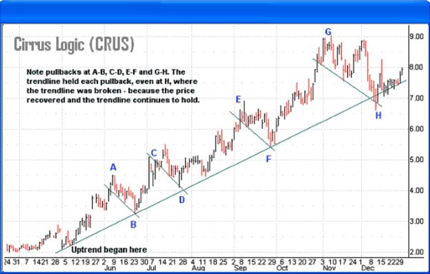
Price touched the trend line at B, D, F and H in four separate pullbacks, but recovered each time, meaning that the trend line was acting as a support level. At Point H, the price penetrated the trend line, which is a bit worrisome; but notice that of all the trading days at Point H along the trend line, there were only two closes below the trend line, which indicates that the trend line held solidly. In fact, price is climbing along the trend line. Verdict: this stock is still in an uptrend.
The NASDAQ Composite (QQQ)
Figure 7.3 is a great teaching chart and poses an interesting question: is the COMPX still in an uptrend in late December or has it gone into a trading range? The longer-term major trend (blue line) began in March 2003. Note the higher lows and higher highs marked by horizontal lines. But while each successive high and low still is higher than the one before, each is increasingly less high than the one before, indicating that the trend is losing force and that the market may go into a trading range or even reverse.
If the price line breaks below the upper (red) trend line, it will be a fairly reliable signal that the uptrend is completely out of steam and has gone into a trading range or is reversing.
Figure 7.3

Note in Figure 7.3 how at Point F the main trend was broken and the trend changed pitch to a gentler angle. Trends change pitch and their angles can become sharper or shallower. The original trend held through Points 1, 3, B and D, but at point F the trend line was decisively penetrated, with five closes below the trend line. This is where the trend changed pitch.
Notice how in the C-D, E-F and G-H pullbacks, the pullback move from the highs shrank a little with each pullback, but the price recovery shrank even more each time, which is why the higher highs and higher lows grew ever smaller. Look at it this way: at A, C, E and G, the price advance grew successively smaller (that is, got weaker) at each move.
The original trend that began in March 2003 clearly was broken at point F. The market did not reverse at that point. But when a trend is broken the market or stock does not always reverse; sometimes it changes pitch, usually to a weaker but sometimes more sustainable pitch. And sometimes it goes into a trading range. This happens because the buying necessary to sustain the original trend was no longer there, but there was enough buying at that point to prevent a reversal from occurring.
Although the market briefly recovered after pulling back to Point F, it again pulled back at H to the new trend line. For this reason, to draw the trend line below the trend’s beginning in March at H would be extremely misleading. It makes more sense to draw two separate trend lines on this chart due to the significant change in pitch.
Danger sign: note that at Point 1, the price recovered but only as high as the original longer-term trend line and pulled back. It lacked the strength to even break above the original trend line, which at this point appears to have become resistance. Put differently, the price action is no longer making higher highs. The above chart shows that the NASDAQ’s upward trend is losing steam quickly and recently, indicating that the original trend may be over and that a reversal or trading range might be near.
If this were a chart for an individual stock, the stalling of the uptrend indicates that OTM writes are not in order, since the energy to move price higher is not in evidence.
Identifying Downtrends
A stock is in a downtrend if it is making lower lows and lower highs. To draw a trend line, draw a straight line above the chart across the tops of the two highest points reached by price during the downtrend. Three highs are more reliable yet.
Trimeris (TRMS)
The TRMS chart at Figure 7.4 shows a protracted strong downtrend beginning in November 2002 that continued through December 2003, briefly interrupted by a trading range. Trend A is a strong downtrend that began at Point A1 and ended until the stock broke through the downtrend line at A2. TRMS then went into a trading range between lines B and C, which acted as resistance and support levels. At Point D1 the stock went back into an even stronger downtrend. A trading range is a continuation pattern, meaning that when the ranging ceases, price has to advance or decline. The best bet is that price will continue in the direction it was moving when the range occurred – in this case, downward. Note the attempted breakthroughs at D2, D3 and D4.
Figure 7.4 – Failed breakout from range, TRMS

How should we read point D5 in the chart above? The answer is as a failed breakout, since it sold off and continued to fall even lower than the dip between D4 and D5. Failed breakouts are particularly potent, much more so than ordinary signals. Chart analysis shows us how the trend line acted as price resistance, because in four tries (D2 – D5), all attempted breakthroughs failed. Even to a novice chart reader, this stock was in a serious decline.
BiovailCorp (BVF)
How about BiovailCorp as a place to throw away your inheritance? The initial downtrend (Trend A) in Figure 7.5 was no slouch. BVF got back to the trend line only once, at Point A2. Then the price really went over the cliff and began Trend B. This is a major trend shift and the ugliest of all – accelerating downtrend.
Note the numerous unfilled price gaps and overall weakness. All this negative action occurred during the best stock market in years. This stock may finally have found support and arrested its decline in December, but who cares? There will always be a better place to put our call-writing dollars.
Figure 7.5 – Accelerating trend, BVF

Identifying Ranging Stocks
A stock is in a range when the price line is running sideways in no clear uptrend or downtrend. Novice chart readers frequently are confused where the trend ends and ranging begins, but the answer is simple. A trend becomes a channel when the stock or market stops making higher highs/higher lows or lower highs/lower lows. A ranging stock has a definite bottom (support) and top (resistance). In fact, stocks trading in wide ranges can have two levels of support and resistance. A range is a continuation pattern, and when the ranging ends, the odds are that the stock or market will continue in the same direction it had when the ranging movement began. Until the stock establishes a low and high, there is no way to be certain that it is in a range.
SOHU.COM (SOHU)
The following SOHU chart at Figure 7.6 illustrates an uptrending stock that has gone into a clear trading range. In March 2003 the stock went into a moderate uptrend (Trend A) and then the trend accelerated in May to a very steep trend (Trend B).
Note how the stock went into a trading range at Point 1. That is obvious only in retrospect, however, because until the stock hit the early August low and recovered, there was no way to tell that it was ranging until Point 1. The price failure at Point 2 confirmed that the uptrend was over and that either a range or a downtrend had begun.
Notice how at Point 2 the trading range begins shrinking: the trading range forms a downtrend line although the bottom line of the range does not change. This formation is known as a descending triangle and indicates an imminent downtrend. Why?
Each time the price runs up, the advance is progressively smaller, although the selling has no trouble knocking it right back down to the support line. When the increasingly weak buying gets weak enough (when the point of the forming triangle is completed), a new downtrend is likely.
It is instructive that the stock did not again touch the same price low as Point 1 until November. Thus even though the stock was ranging, the range was ragged and not very reliable. This stock presents real danger for a stock buyer, because the prognosis is entirely negative.
Figure 7.6 – Trending stock goes into a range, SOHU

This stock also illustrates another problem of ranging stocks. Even though charting instructional books often present the trading range as a neat sine wave pattern, in reality many ranges are quite uneven and price does not move neatly between a defined top and bottom.
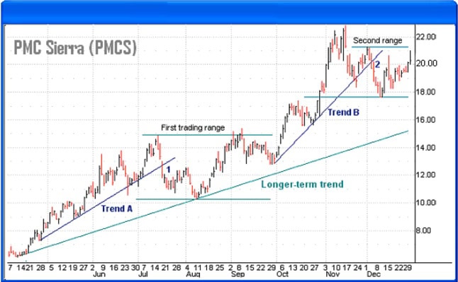
PMC Sierra (PMCS)
The PMC Sierra at Figure 7.7 below shows a stock that is in an overall uptrend but hesitated twice in trading ranges. This is the point of trading ranges, of course, since they usually are continuation patterns. The stock went into the first trading range at Point 1, when Trend A stalled out and price broke the trend line.
The trend resumed (Trend B) in September and topped out again, then broke the second trend line in December at Point 2 to initiate a second range. The chart must be viewed as a trending one with brief interruptions. As the longer-term (teal) trend line indicates, drawing a single trend line under the two lowest prices can illustrate the overall trend.
Figure 7.7 – Brief hesitation ranges, PMCS
Concord EFS (CE)
In the Concord EFS (CE) chart appended as Figure 7.8 below, the stock first went into a trading range at Point 1 (quit making higher lows) , dropped like a set of keys and then formed a new, lower trading range beginning at Point 2. These are trading ranges, because they are not trends. Always look at the lows and highs. If they are not successively higher or lower, there is no clear trend.
Finally, notice that before this stock went into its first range, there was no clear uptrend (try to draw a trend line). A chart with gaps this size and wide-ranging price days this size scares us off. I like our stocks much more predictable than this.
At the end of this chart the stock is at 13.60, so where is support? The support line in the trading range is no good, because the price decisively violated it in October, turning it now a resistance level. The answer is: the former resistance level at 11.80, which was transformed into a support level with the December price breakout. This is a highly volatile stock. Having seen this chart, one would hardly know what covered call strategy to apply. It is thus best avoided.
Note the trading range from May through most of October. Price did not range neatly between the top and bottom of a well-defined range. In fact, until the stock first hit the range bottom at about $13.40, we didn’t know where the lower bound of the range was. Note how the stock tested support four times, finally failing and breaking down decisively in late October. Interestingly, the May-October range is a declining one (another descending triangle); it is not a downtrend, because it is not making both lower highs and lows, only lower highs. And as we expect of a descending triangle, the end result was a price breakdown at the end.
Figure 7.8 – Chart showing support and resistance levels, CE

The May-October range tightened up in August, with $15 becoming the effective new range top. We must beware of writing a ranging stock at range tops. It is far better to put on short-term OTM writes at the range bottoms, when the range already in motion offers the prospect of moving the stock back up in the range, resulting in assignment. The problem with a stock forming a descending triangle is that, while we can be confident that a price breakdown will occur, the exact breakdown point is not knowable in advance. Writing this stock in the May-October range would have been a gamble that call writes could be concluded before the breakdown.

The author has no position in any of the stocks mentioned. Financhill has a disclosure policy. This post may contain affiliate links or links from our sponsors.